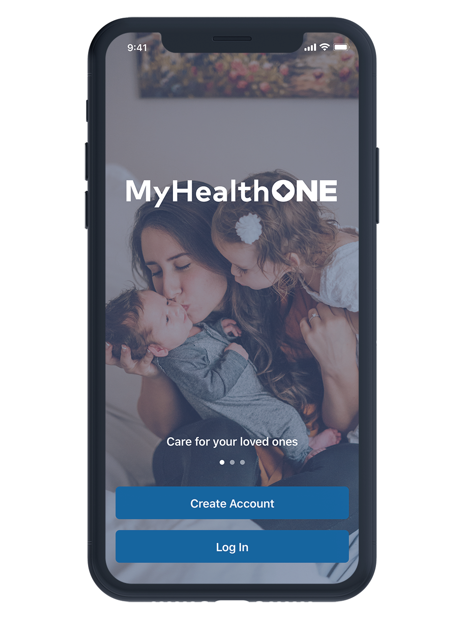
MyHealthONE Mobile App
MyHealthONE is HCA Healthcare's online patient portal. After initially launching as a web only platform, HCA quickly recognized the need to develop a native iOS and Android app to allow patients to manage their healthcare quickly and easily from anywhere. The MyHealthONE mobile app went live on both Apple's App Store and the Google Play Store in early 2020.
Problem Statement
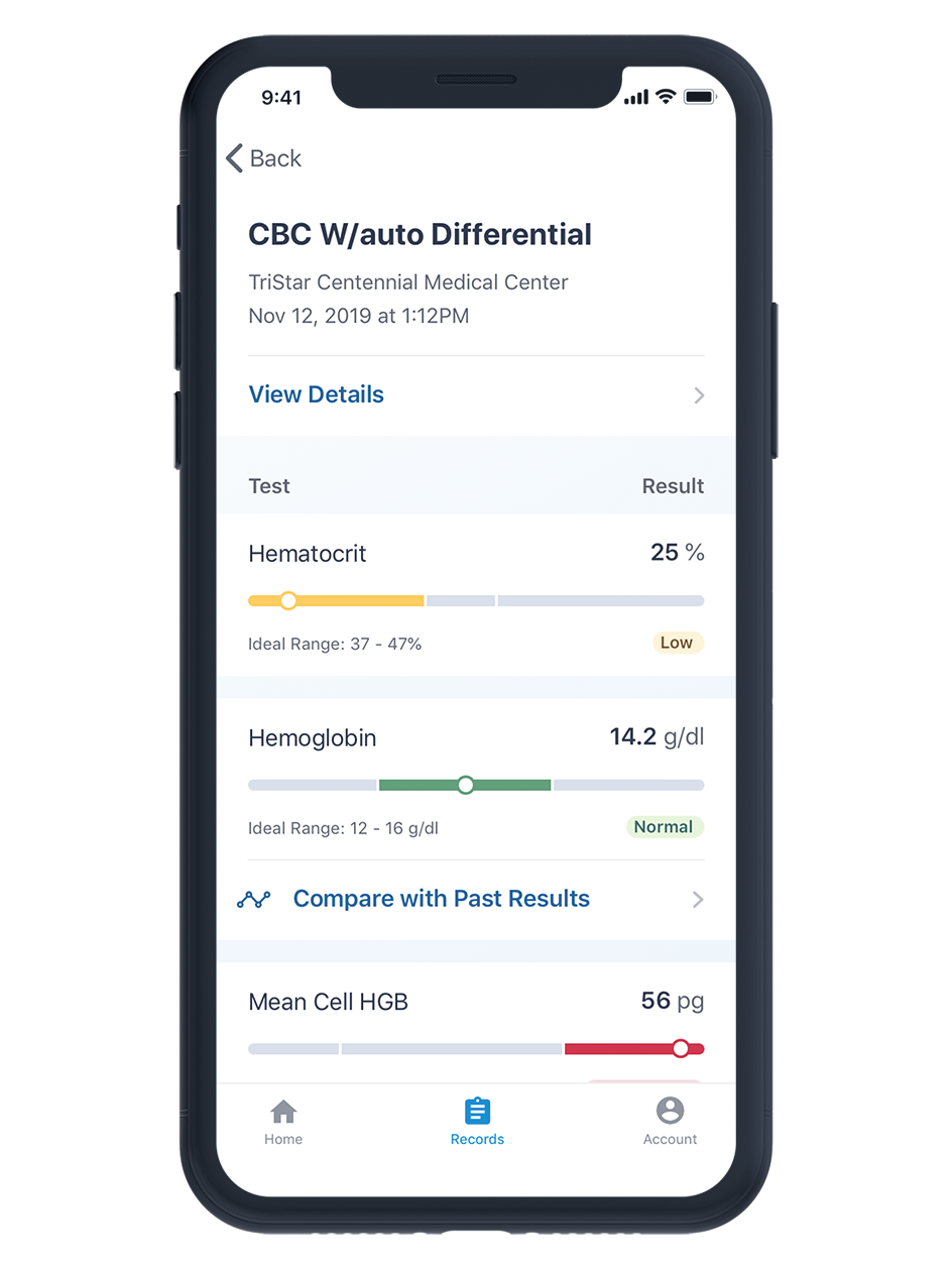
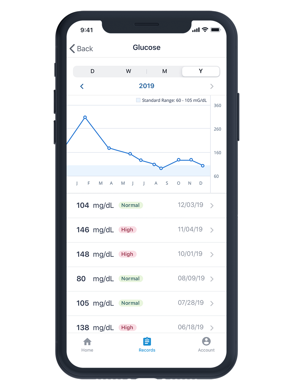
HCA Healthcare wanted a way to guide patients along their health journey both during and after treatment. While the web product had high conversion rates after a health visit, patients did not return to the portal frequently (52% of users had logged in only once). We hoped to increase patient retention by introducing a mobile app. A key challenge of this project was to translate the existing functionality of the web product into a native experience. We aimed to simplify the data heavy, complex nature of health data into a clean, understandable, and accessible mobile interface.
My Role
I was one of two UX designers on the project. We worked closely with a small internal product development team, made up of a project manager, product analyst, and mobile developers to define the strategy, design and requirements for the MVP. We worked with an external development agency (YML) to build and launch the app.
Process

Problem Definition and Analysis
When we first began the project, we did not have specific targets and goals for the mobile app. We worked with our stakeholders to define specific business and user goals and KPI's. We determined that one of the largest opportunities with a mobile app was to engage with and retain patients long after they've left the hospital.
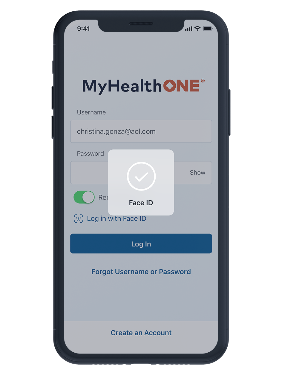
We started by analyzing the existing web application to understand current pain points and opportunities. We ran usability tests, gathered data and analytics, and spoke with the support team. We found that some of they key pain points were two-factor authentication upon logging in, large data tables that didn't scale well to mobile, and confusion around complex health data.
Information Architecture
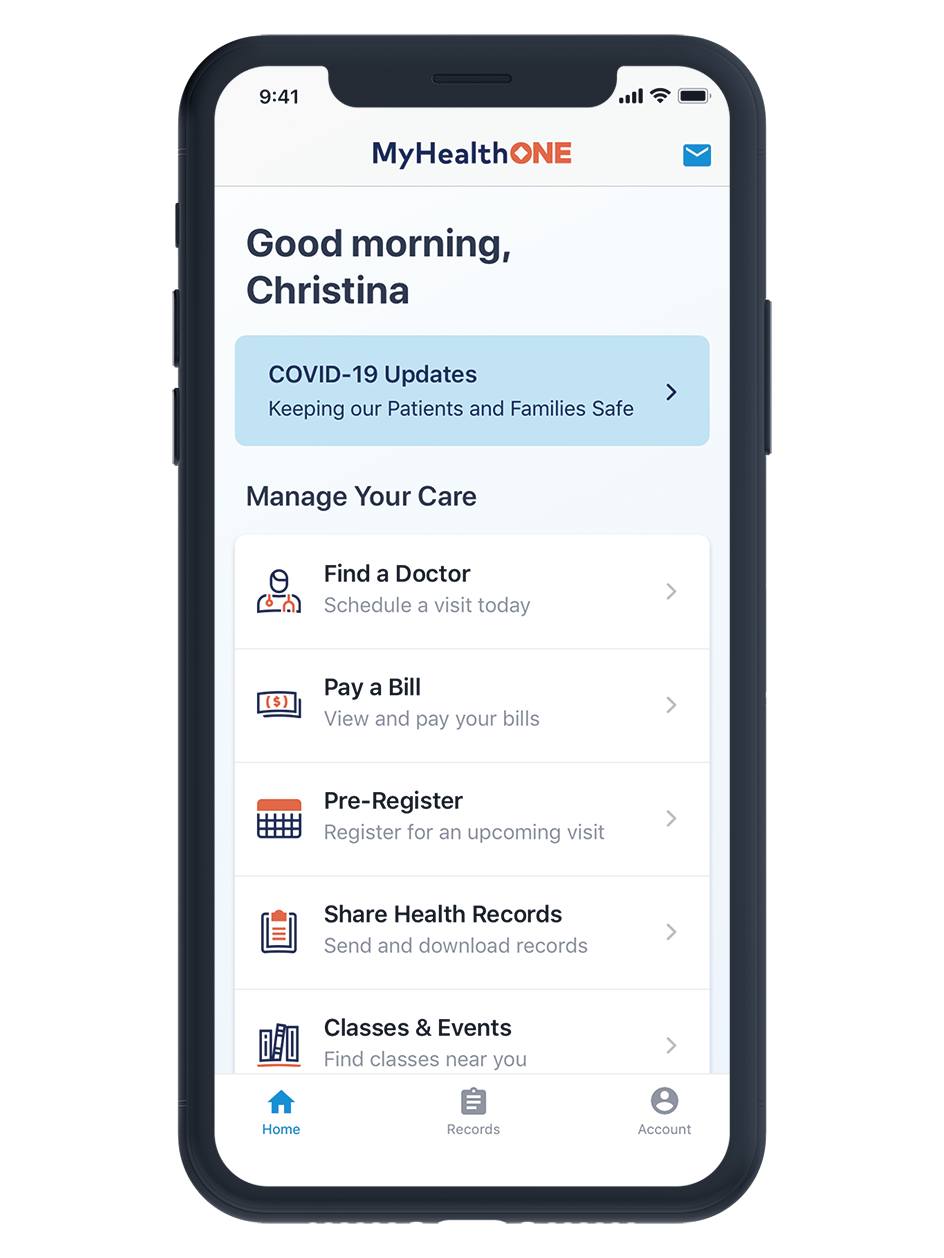
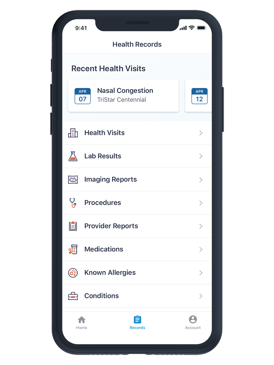
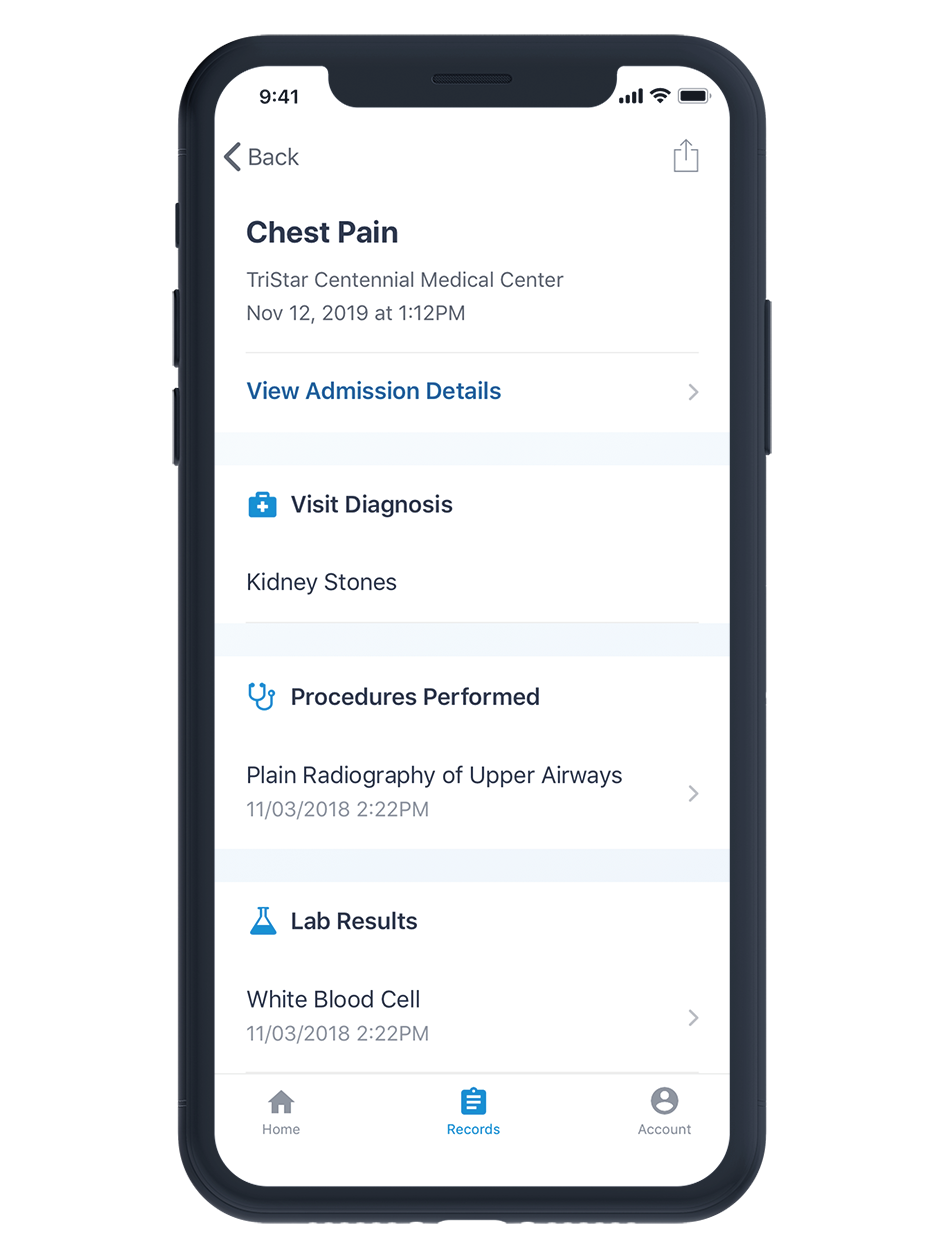
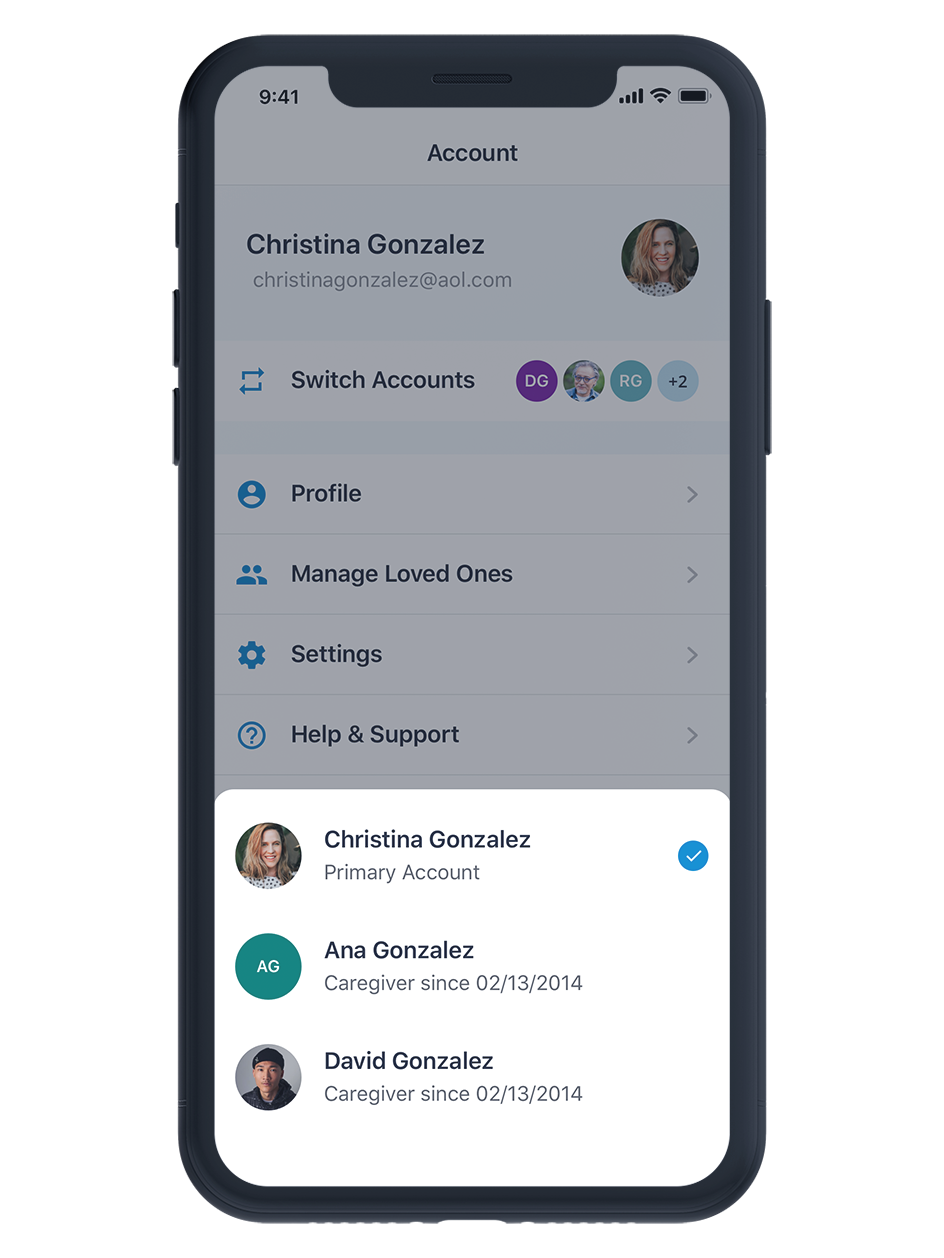
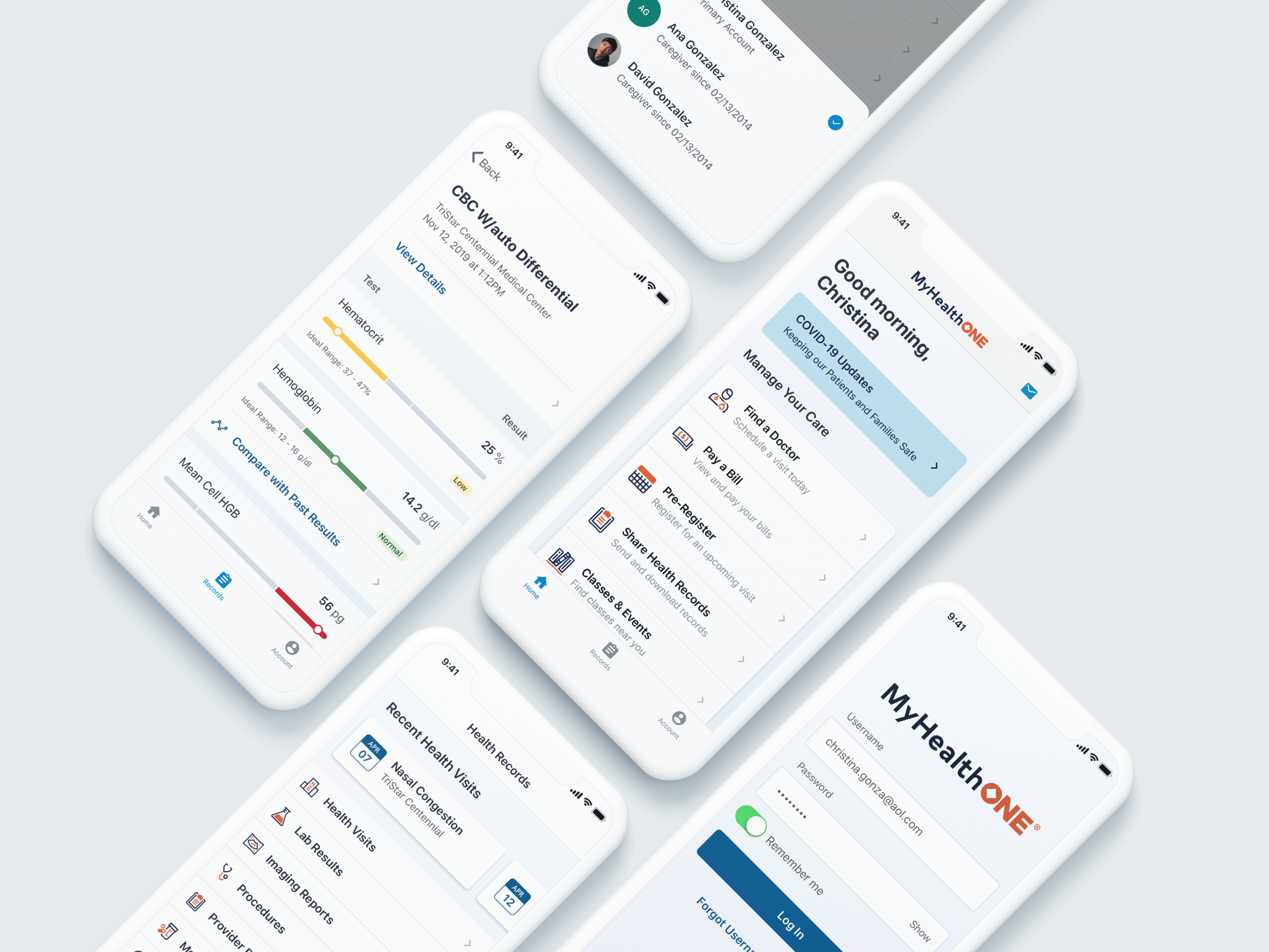
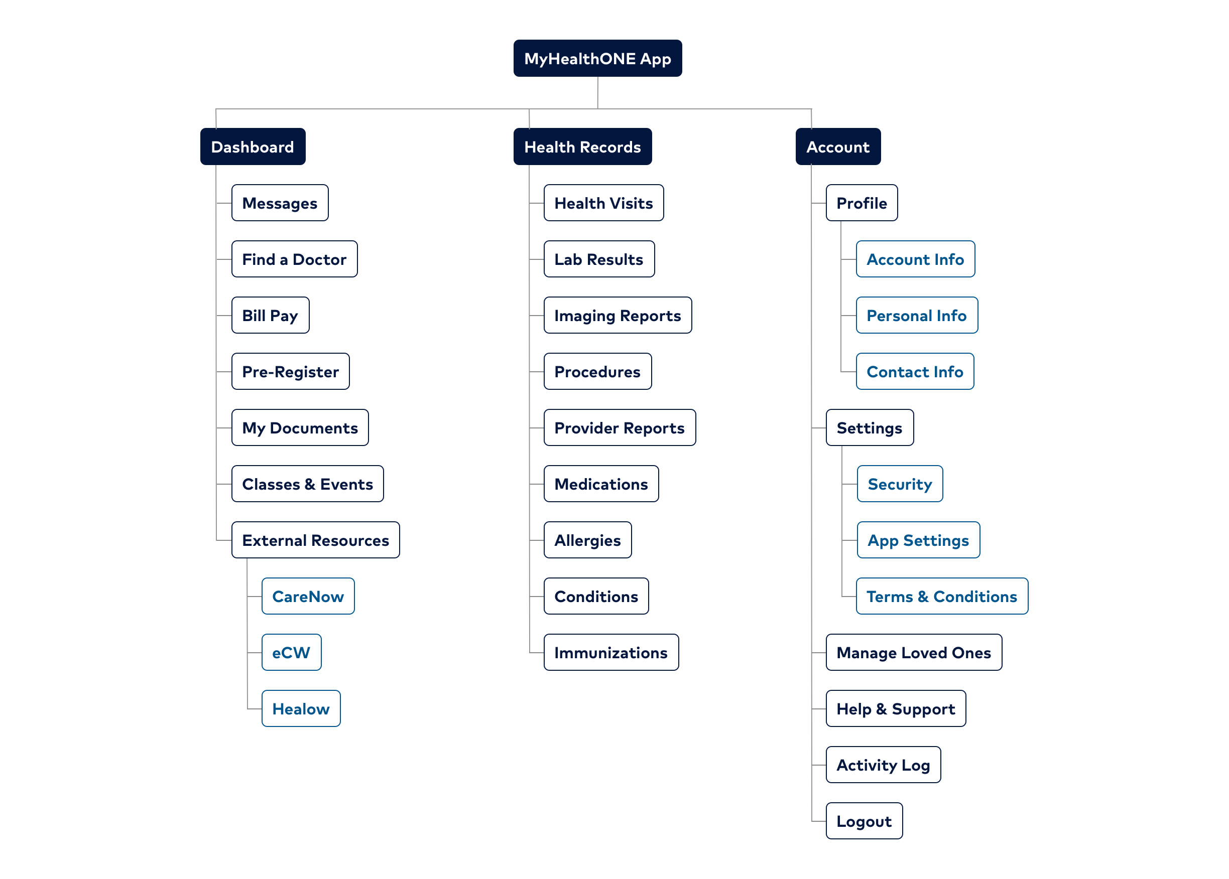
Next, we ran a card sorting test with users to determine the information architecture for the mobile app. While the web product had divided patient's health information into two sections (health records, which contained visit-specific information and health summary, which held patient-specific information), we determined that patients did not differentiate between the two, so we combined them into a single "Records" tab. We were also able to combine multiple sections of the web app into a single "Account" tab. We reserved the "Home" tab for action and care related information, such as booking appointments, viewing and sending messages, and paying their bills. We were able to create a simpler navigation that will allow the app to easily scale as additional features and functionality are added.

Wireframes
We then began to create wireframes of the primary app screens to understand and validate the structure before diving into the design of each feature. Once we had determined the basic structure of the app, we split the remaining work between myself and the other designer. While we still collaborated and shared progress daily (we even shared a desk while at the office), we owned different areas of the app in order to be quicker and more efficient. I focused on Health Records and Account features, while he focused on Onboarding, Registration, and Messaging. We planned out our work into a series of two-week sprints, where we would each aim to research, design, and test a feature in a given sprint.

Component Library
In order to create comps and prototypes quickly and maintain consistency across our designs, I created a shared component library and design guidelines document. As one of us created a new component, I'd add it to the library so that we could easily use it elsewhere. Since we were creating both an Android and iOS app, I typically created two versions of each component — one based on Apple's HIG, and one based on Google's Material Design.
High Fidelity Comps & Prototypes
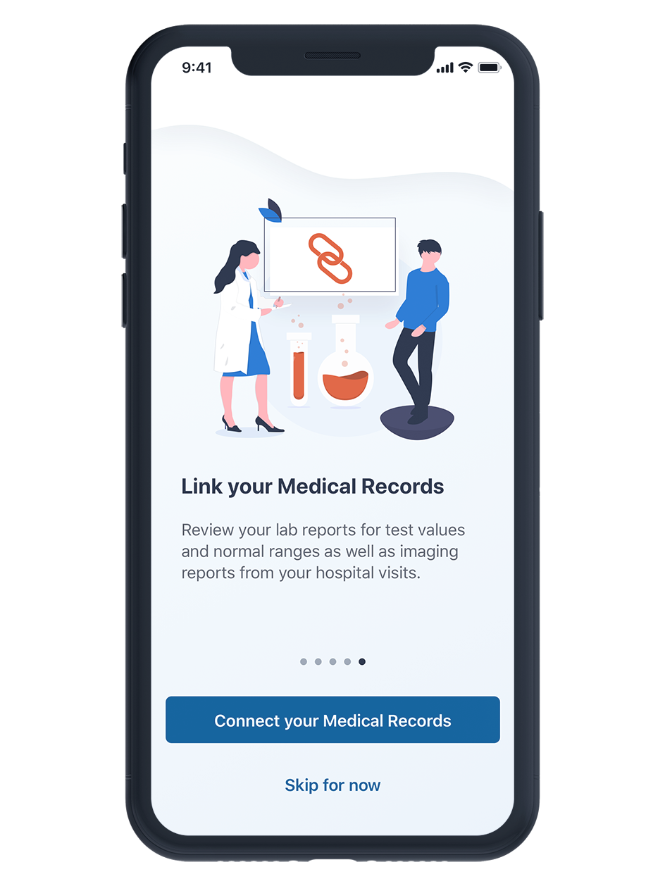
See the images below for some of the final app screens. Once we created high-fidelity comps and prototypes, we conducted usability testing on each user flow.